Hello again 
During the conversation with one of my users, I found room for improvement in UX UI. Please do NOT take it as an offense about the great JLex Review component but a piece of advice to improve User Experience.
1) Go into this URL
https://truckercheckin.com/europa/hiszpania/33400-dhl-santa-perpetua-de-mogoda-barcelona?review_id=76
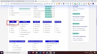
2) GO INTO REVIEW SECTION AND CLICK FIRST AVAILABLE BOX
CLICK. VISIT -> LOADING ( image attached UXUI_at_latest_review_module.jpg )
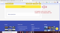
3) I AUTOMATICALLY GO INTO END OF REVIEW SECTION
( image attached UXUI_at_latest_review_module2.jpg )
and this is DUMP USER end his surfing experience because he thinks that he made something wrong. If You can move NO REVIEW button into the CENTER of the WEBVIEW it would so much better UX. How you think is this something You can do


